


What is Next.js
Next.js is a modern React-based framework used for building web applications that are fast, scalable, and search engine friendly. It simplifies many aspects of web development by providing built-in features such as server-side rendering, static site generation, and API routes.

One of the key advantages of Next.js is its ability to improve application performance and search engine optimization through server-side rendering. This means pages can be prepared on the server before reaching the user, resulting in faster load times and better visibility on search engines.
Another important feature of Next.js is its App Router system. This allows developers to organize pages and layouts using a folder-based structure, making the codebase easier to navigate and maintain.
Why Next.js Was Chosen
Here are the main reasons Next.js was selected for this project,
Clear and Organized Structure
Instead of writing complicated code just to connect different pages, Next.js does it for you based on how your files are organized. It provides a clear and organized structure.
Optimized Performance
It does a lot of the heavy lifting behind the scenes, like preparing pages before the user even clicks on them. This means the user experiences faster transitions and smoother performance.
Support for Modern Development Practices
It works perfectly with the tools that developers already use, like React and TypeScript. It supports modern development practices without adding unnecessary complexity.
Technologies Used in the Project
In addition to Next.js, several other technologies were used to build the application effectively.
React was used as the core library for building user interfaces. It enables the use of reusable components that manage their own state, making the development process modular and efficient.
TypeScript was used to improve code reliability. By defining types for variables, functions, and components, it helps detect errors during development rather than at runtime.
Tailwind CSS was used for styling the application. It provides a utility-first approach, allowing developers to style components directly in the markup without writing separate CSS files.
Framer Motion was used to implement animations. It adds smooth transitions and interactive effects, improving the overall user experience.
These technologies work together to create a balanced system where performance, design, and maintainability are all addressed.
Introduction to the Project
This project was developed as a modern web application using Next.js with the aim of building a structured, scalable, and visually engaging platform.

Instead of developing the application in an unorganized way, the project follows a component-based architecture. Each section of the application is built as an independent, reusable component.
The project also maintains a clear separation between layout, data, logic, and styling. This approach makes it easier to update individual parts of the application without affecting the rest.
Application Structure and Routing
The project follows the App Router structure provided by Next.js, which organizes pages based on the file system.
The root layout file layout.tsx defines the overall structure of the application, including global fonts, metadata, and shared components like the header and footer.
The main landing page page.tsx combines multiple sections such as the hero section, features, testimonials, pricing, and blog listings into a single view.
A dynamic routing system is implemented for blogs using a parameterized route. This allows individual blog posts to be rendered based on their unique identifiers.
Data Management
One of the key design decisions in this project is the separation of data from UI components.
Instead of hardcoding content inside components, data is stored in separate files. For example, blog content, testimonials, and pricing details are maintained in dedicated data files.
This approach improves maintainability, as content updates can be made without modifying component logic.
Component-Based Architecture
The project follows a component-based architecture, where the user interface is divided into smaller, self-contained pieces.
Each component is designed with a specific responsibility. For example, navigation is handled by the header component, content display is handled by section components, and user interactions are handled by button and form components.
This modular approach reduces code duplication and improves consistency across the application. It also makes testing and debugging more manageable.
Layout Components
The Header and Footer components form the global structure of the application.
The header provides navigation and remains visible during scrolling, improving accessibility. It also adjusts its layout based on screen size.

The footer contains structured information, including links and additional resources. It is designed to be informative without overwhelming the user.
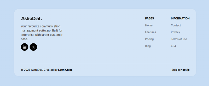
Together, these components ensure a consistent layout across all pages.
Reusable UI Components
The project includes several reusable UI components that improve consistency and reduce repetitive code.
The AnimatedButton component is used across the application for all call-to-action buttons. It integrates animation and consistent styling.
Card components such as BlogCard, TestimonialCard, and PricingCard are used to display different types of content in a structured format.

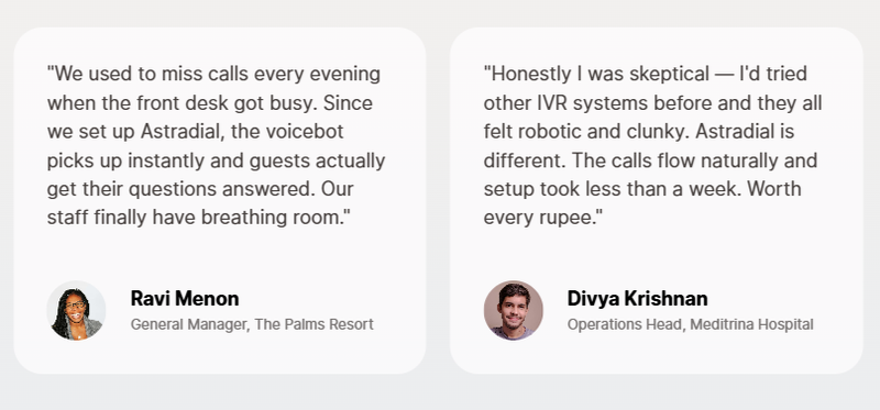
These components demonstrate how a single design pattern can be reused for multiple purposes within an application.
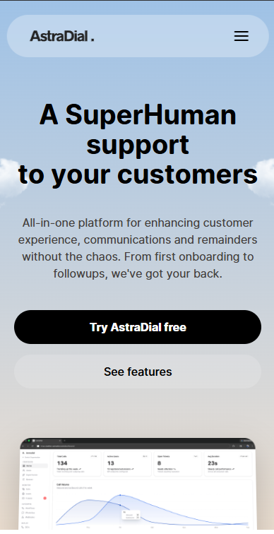
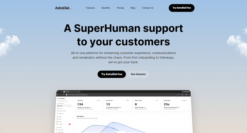
Hero and Feature Sections
The hero section is the primary visual element of the landing page. It is designed to capture user attention with clear messaging and visuals.
Additional components such as feature sections and image-based sections are used to present information in an organized way.
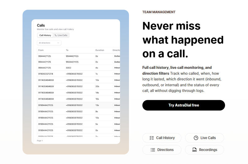
Some sections also include interactive elements and animations, which improve user engagement and make the content more dynamic.
Animation and User Experience
Animations in the project are implemented using Framer Motion. These animations are used carefully to enhance the user experience without impacting performance.
Interactive elements such as buttons and image sections respond smoothly to user actions. Some animations are triggered when elements become visible on the screen, creating a natural flow.
The goal of using animation in this project is to make the application feel modern and responsive while keeping the interactions intuitive.
Blog and Dynamic Content Rendering
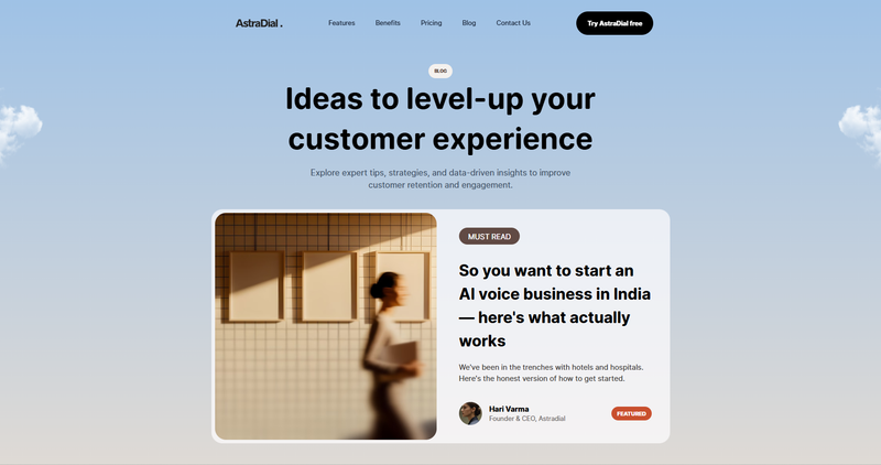
The project includes a blog system that demonstrates dynamic content rendering.
A list of blogs is generated automatically using a mapping approach, where data is read from a centralized file and rendered using reusable card components.
This design allows the application to scale easily, as new blog entries can be added without modifying any component code.
Responsive Design
The application is designed to work across different screen sizes, including desktop, tablet, and mobile devices.
Tailwind CSS is used for most responsive styling, while additional CSS is used for more complex layout adjustments.
This ensures that the application provides a consistent experience regardless of the device being used.
Conclusion
This project demonstrates the use of modern web development practices using Next.js and React. It highlights the importance of organized code structure, reusable components, and thoughtful design decisions.
By combining technologies such as TypeScript, Tailwind CSS, and Framer Motion, the project achieves a balance between functionality, appearance, and developer experience.
Share on social media
